c:ドライブのユーザーフォルダー(自分の名前やメールアドレスの一部)に
新規フォルダを作る(jupyter_notebook等)
次にコマンドプロンプトから
>cd jupyter_notebook
>jupyter notebook
と入力する
c:ドライブのユーザーフォルダー(自分の名前やメールアドレスの一部)に
新規フォルダを作る(jupyter_notebook等)
次にコマンドプロンプトから
>cd jupyter_notebook
>jupyter notebook
と入力する
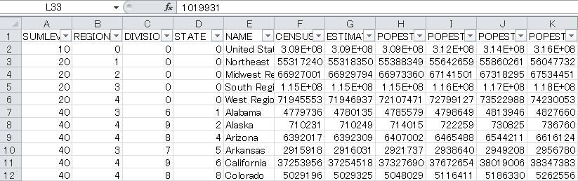
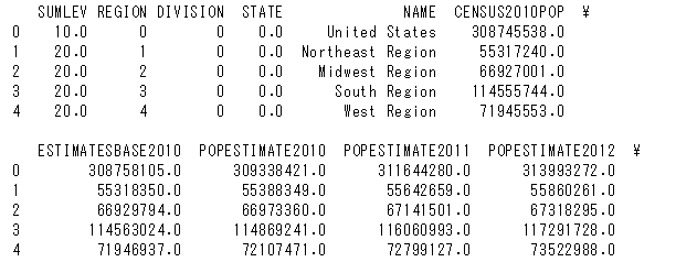
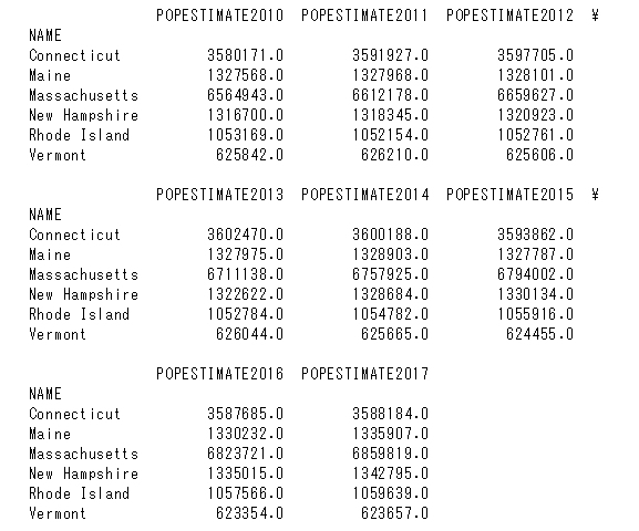
US CENSUSの人口データを使用して
CSVのデータをデータフレームに入れて色々操作します。
使用するCSVデータ:nst-est2017-alldata-1.csv
|
1 2 3 4 5 6 |
import pandas as pd import plotly.offline as pyo import plotly.graph_objs as go df = pd.read_csv("nst-est2017-alldata.csv") print(df.head()) |
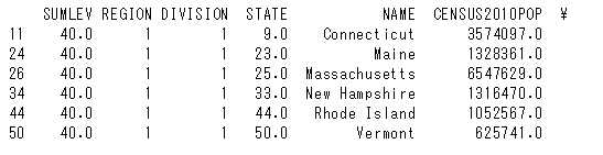
df2という名称のデータフレームに分けて
カラムがDIVISIONでありかつ値が1の物だけを入れる
|
1 |
df2 = df[df["DIVISION"] == "1"] |
カラムNAMEとその列の値を行に変換する
|
1 |
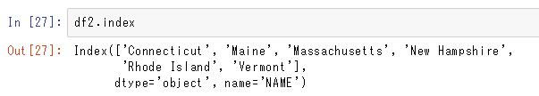
df2.set_index("NAME",inplace = True) |
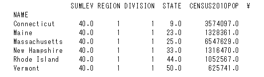
左側にNAMEインデックスが作成されました
※マルチインデックスにするにはdf.set_index([“a”,”b”])とする
“POP”という文字で始まるカラムのみを抽出
|
1 2 |
list_of_pop_col = [col for col in df2.columns if col.startswith("POP")] df2 = df2[list_of_pop_col] |
|
1 2 3 4 5 6 |
data = [go.Scatter(x=df2.columns, y=df2.loc[name], mode="lines", name=name) for name in df2.index] pyo.plot(data) |
上記コードの詳細を以下に記載します。
x=df2.columnsとなっているのはx軸に各カラムの名前を入れていく
作業になります。

y=df2.loc[name]と指定しています。
[go.Scatter…]の最後にfor name in df2.indexとあるので
先程df2.set_index(“NAME”,inplace = True)にて設定した
インデックスの数だけ繰り返す形になります。
上記6種類のインデックスがあるので6回繰り返して
地名をnameに代入します。
代入されたnameの地名に該当する値をデータフレームの
左から右に読み込んでいきます。
|
1 |
mode="lines" |
“lines”を指定して線グラフにします。
|
1 |
name=name |
for name in df2.indexでインデックスにある地名をnameに代入し、
これによって出力されたグラフに各線グラフの名称が
表示されるようになります。
|
1 2 3 4 5 6 7 8 9 10 11 12 13 14 15 16 17 18 19 20 21 |
import pandas as pd import plotly.offline as pyo import plotly.graph_objs as go df = pd.read_csv("nst-est2017-alldata.csv") print(df.head()) df2 = df[df["DIVISION"] == "1"] df2.set_index("NAME",inplace = True) list_of_pop_col = [col for col in df2.columns if col.startswith("POP")] df2 = df2[list_of_pop_col] data = [go.Scatter(x=df2.columns, y=df2.loc[name], mode="lines", name=name) for name in df2.index] pyo.plot(data) |
グラフの線を曜日別に表示する
以下の例ではわかりやすくする為df2を作成し、
forが回る度に曜日別のデータをgo.Scatterで入れていきます。
|
1 2 3 4 5 6 7 |
for day in days: df2 = df[df["DAY"] == day] trace = go.Scatter(x=df2["LST_TIME"], y=df2["T_HR_AVG"], mode="lines", name = day) data.append(trace) |
もう少しすっきりさせるには以下のようにします。
|
1 2 3 4 5 6 |
for day in days: trace = go.Scatter(x=df["LST_TIME"], y=df[df["day"]==day]["T_HR_AVG"], mode="lines", name = day) data.append(trace) |
高度な書き方だとforを使用せず辞書に曜日別データを入れていきます。
|
1 2 3 4 5 |
data = [{ "x":df["LST_TIME"], "y":df[df["DAY"]==day]["T_HR_AVG"], "name":day } for day in df["DAY"].unique()] |
使用するCSVデータ:2010YumaAZ.csv
|
1 2 3 4 5 6 7 8 9 10 11 12 13 14 15 16 17 18 19 20 21 22 23 24 25 26 27 28 29 30 31 32 |
import pandas as pd import plotly.offline as pyo import plotly.graph_objs as go # Create a pandas DataFrame from 2010YumaAZ.csv df = pd.read_csv("2010YumaAZ.csv") days = ['TUESDAY','WEDNESDAY','THURSDAY','FRIDAY','SATURDAY','SUNDAY','MONDAY'] # Use a for loop (or list comprehension to create traces for the data list) # data = [] for day in days: df2 = df[df["DAY"] == day] trace = go.Scatter(x=df2["LST_TIME"], y=df2["T_HR_AVG"],#あるいはdf2を作らずにy=df[df["day"]==day]["T_HR_AVG"],としてもよい mode="lines", name = day) data.append(trace) # Define the layout layout = go.Layout(title="Daily temp avgs") # Create a fig from data and layout, and plot the fig fig = go.Figure(data=data,layout=layout) pyo.plot(fig) |
自作関数の外部、内部のどちらで変数を宣言するかによって
使用できる範囲が異なる
|
1 2 3 4 5 6 |
name = "max" def get_name(): name = input("Your name:") get_name() print(name) |
|
1 2 3 |
>>> Your name:Michael max |
上記の例では自作関数の外部でname=maxが宣言されているので
自作関数内部で別の変数が代入されたとしてもそれは
自作関数内部でのみ有効となるのでコードの最後でprintで変数name
を呼び出しても最初に宣言したmaxが表示される事になる
コードの最後のprintの部分で自作関数内で設定された変数の値を
反映させるには自作関数内部でglobal nameと記述し、
変数nameはグローバル関数と宣言する
そうすればコードの最後の部分のprintでは自作関数内で上書きされた
変数の内容が反映される事になる
|
1 2 3 4 5 6 7 |
name = "max" def get_name(): global name name = input("Your name:") get_name() print(name) |
|
1 2 3 |
>>> Your name:Michael Michael |
Plotly/Dashでインタラクティブなグラフ作成
ほんの数行のコードで以下のようなグラフができちゃいます。
Bokehより簡単だ、、、
|
1 2 3 4 5 6 7 8 9 10 |
import numpy as np import plotly.offline as pyo import plotly.graph_objs as go np.random.seed(42) random_x = np.random.randint(1,101,100) random_y = np.random.randint(1,101,100) data = [go.Scatter(x=random_x, y=random_y, mode="markers")] pyo.plot(data,filename="scater.html") |
|
1 2 3 4 5 6 7 8 9 10 11 12 13 14 15 16 17 18 19 20 21 22 23 24 25 |
import numpy as np import plotly.offline as pyo import plotly.graph_objs as go np.random.seed(42) random_x = np.random.randint(1,101,100) random_y = np.random.randint(1,101,100) data = [go.Scatter(x=random_x, y=random_y, mode="markers", marker=dict( size=12, color="rgb(51,204,153)", symbol="pentagon", line= {"width":2} ))] layout = go.Layout(title="hello first plot", xaxis=dict(title="My Y axis"), yaxis=dict(title="My Y axis"), hovermode="closest") fig=go.Figure(data=data,layout=layout) pyo.plot(fig,filename="scater2.html") |
線グラフは上記のスキャッタープロットと同じように
go.Scatter()内にmode = ‘lines’を追加する
|
1 2 3 4 5 6 7 8 9 10 11 12 13 14 15 16 17 18 19 20 21 |
import plotly.offline as pyo import plotly.graph_objs as go import numpy as np np.random.seed(56) x_values = np.linspace(0, 1, 100) # 100 evenly spaced values y_values = np.random.randn(100) # 100 random values trace1 = go.Scatter( x = x_values, y = y_values, mode = 'lines' ) data = [trace1] # assign traces to data layout = go.Layout( title = 'Line chart showing three different modes' ) fig = go.Figure(data=data,layout=layout) pyo.plot(fig, filename='line0.html') |
mode = ‘markers’
mode = ‘lines+markers’
mode = ‘lines’
の3種類を並べてみます
y_valueに+5、0、-5をそれぞれ加えて位置をずらしています。
name=”〇〇”と記述するとグラフの名称が表示されるようになります。
|
1 2 3 4 5 6 7 8 9 10 11 12 13 14 15 16 17 18 19 20 21 22 23 24 25 26 27 28 29 30 31 32 33 |
import plotly.offline as pyo import plotly.graph_objs as go import numpy as np np.random.seed(56) x_values = np.linspace(0, 1, 100) # 100 evenly spaced values y_values = np.random.randn(100) # 100 random values # create traces trace0 = go.Scatter( x = x_values, y = y_values+5, mode = 'markers', name = 'markers' ) trace1 = go.Scatter( x = x_values, y = y_values, mode = 'lines+markers', name = 'lines+markers' ) trace2 = go.Scatter( x = x_values, y = y_values-5, mode = 'lines', name = 'lines' ) data = [trace0,trace1,trace2] # assign traces to data layout = go.Layout( title = 'Line chart showing three different modes' ) fig = go.Figure(data=data,layout=layout) pyo.plot(fig, filename='line1.html') |
|
1 2 3 4 5 6 7 8 9 10 11 12 13 14 15 16 17 18 |
blockchain=[] def get_last_blockchain_value(): return blockchain[-1] def add_value(transaction_amount,last_transaction=[1]): blockchain.append([last_transaction,transaction_amount]) tx_amount = float(input("your transaction amount please: ")) add_value(tx_amount) tx_amount = float(input("your transaction amount please: ")) add_value(last_transaction=get_last_blockchain_value(),transaction_amount=tx_amount) tx_amount = float(input("your transaction amount please: ")) add_value(tx_amount,get_last_blockchain_value()) print(blockchain) |
実行するとyour transaction amount please:と出てくるので
任意の数値を入力していきます。
>>>
your transaction amount please: 2.5
your transaction amount please: 8.6
your transaction amount please: 5.2
[[[1], 2.5], [[[1], 2.5], 8.6], [[[[1], 2.5], 8.6], 5.2]]
|
1 2 3 4 5 6 7 8 9 10 11 12 13 14 15 16 17 18 19 20 21 22 23 |
blockchain=[] def get_last_blockchain_value(): return blockchain[-1] def add_value(transaction_amount,last_transaction=[1]): blockchain.append([last_transaction,transaction_amount]) def get_user_input(): return float(input("your transaction amount please: ")) tx_amount = get_user_input() add_value(tx_amount) tx_amount = get_user_input() add_value(last_transaction=get_last_blockchain_value(),transaction_amount=tx_amount) tx_amount = get_user_input() add_value(tx_amount,get_last_blockchain_value()) print(blockchain) |
>>>
your transaction amount please: 1.3
your transaction amount please: 5.8
your transaction amount please: 5.6
[[[1], 1.3], [[[1], 1.3], 5.8], [[[[1], 1.3], 5.8], 5.6]]
以下のようなcsvファイルがあった場合
|
1 2 3 4 |
Name Salary Age 0 John 50000 34 1 Sally 120000 45 2 Alyssa 80000 27 |
年齢が30以上の人のデータのみを取得した場合は
|
1 2 |
aaa = df["Age"] > 30 print(df[aaa]) |
以下のように年齢が30以上のデータが表示されます。
>>>
Name Salary Age
0 John 50000 34
1 Sally 120000 45
True か Falseですべての情報をチェックしたい場合は
以下のようなコードになります。
|
1 2 |
aaa = df["Age"] > 30 print([aaa]) |
>>>
[0 True
1 True
2 False
Name: Age, dtype: bool]