|
1 2 3 4 5 6 7 8 9 10 |
from scipy import sparse import numpy as np %matplotlib inline import matplotlib.pyplot as plt x = np.linspace(-10,10,100) y = np.sin(x) plt.plot(x,y,marker="x") |

|
1 2 3 4 5 6 7 8 9 10 |
from scipy import sparse import numpy as np %matplotlib inline import matplotlib.pyplot as plt x = np.linspace(-10,10,100) y = np.sin(x) plt.plot(x,y,marker="x") |
動くグラフ
https://www.reddit.com/r/dataisbeautiful/comments/7l9ef7/i_simulated_and_animated_500_instances_of_the/
|
1 2 3 4 5 6 7 8 9 10 11 12 13 14 15 16 17 18 19 20 21 22 |
from matplotlib import pyplot as plt import numpy as np import time from IPython.display import display, clear_output %matplotlib inline fig = plt.figure(figsize=(16,10)) axe = fig.add_subplot(111) # 繰り返す回数を決める num = 5 for i in range(num): A = np.random.randn(1000) axe.hist(A,bins=50) axe.set_xlim([-4,4]) axe.set_ylim([0,70]) display(fig) clear_output(wait = True) # 最後の出力は消さないので、if文で最後だけ消さないようにする。 if i != num-1: axe.cla() |
from IPython.display import display, clear_output
display(fig) 画像を出力します。
clear_output(wait = True) 出力結果を消します。
axeに入れられたグラフデータを削除します。
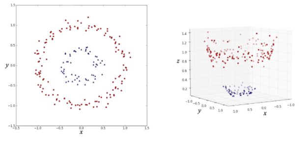
左側の (x, y) 平面上の点を分類する場合、
このままだと線形分類器(直線で分類するアルゴリズム)ではうまく分類できないのが、
右図のように z 軸を追加してデータを変形すると、
平面できれいに分割できるようになって、線形分類器による分類がうまくいくというものです。
このように、高次元空間にデータを埋め込むことでうまいこと分類するのが
カーネル法の仕組みだというわけです。
svc = サポートベクターマシン
|
1 2 3 4 5 6 7 8 9 10 11 12 13 14 15 16 17 18 19 20 21 22 |
from sklearn.svm import LinearSVC from sklearn.svm import SVC from sklearn.model_selection import train_test_split from sklearn.datasets import make_gaussian_quantiles # データの生成 X, y = make_gaussian_quantiles( n_samples=1000, n_classes=2, n_features=2, random_state=42) train_X, test_X, train_y, test_y = train_test_split(X, y, random_state=42) # 以下にコードを記述してください # モデルの構築 model1 = SVC(random_state=42) model2 = LinearSVC(random_state=42)#これは線形 # train_Xとtrain_yを使ってモデルに学習させる model1.fit(train_X, train_y) model2.fit(train_X, train_y) # test_Xに対するモデルの分類予測結果 print("非線形SVM: {}".format(model1.score(test_X, test_y))) print("線形SVM: {}".format(model2.score(test_X, test_y))) |
|
1 2 3 4 5 6 7 8 9 10 11 12 13 14 15 16 17 18 19 20 21 22 23 24 25 26 27 28 29 30 31 32 33 34 35 36 37 38 39 40 41 42 43 44 45 |
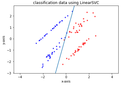
# パッケージをインポート import numpy as np import matplotlib import matplotlib.pyplot as plt from sklearn.svm import LinearSVC from sklearn.model_selection import train_test_split from sklearn.datasets import make_classification # ページ上で直接グラフが見られるようにするおまじない %matplotlib inline # データの生成 X, y = make_classification(n_samples=100, n_features=2, n_redundant=0, random_state=42) train_X, test_X, train_y, test_y = train_test_split(X, y, random_state=42) # 以下にコードを記述してください # モデルの構築 model = LinearSVC(random_state=42) # train_Xとtrain_yを使ってモデルに学習させる model.fit(train_X, train_y) # test_Xとtest_yを用いたモデルの正解率を出力 print(model.score(test_X, test_y)) # 生成したデータをプロット plt.scatter(X[:, 0], X[:, 1], c=y, marker='.', cmap=matplotlib.cm.get_cmap(name='bwr'), alpha=0.7) # 学習して導出した識別境界線をプロット Xi = np.linspace(-10, 10) Y = -model.coef_[0][0] / model.coef_[0][1] * Xi - model.intercept_ / model.coef_[0][1] plt.plot(Xi, Y) # グラフのスケールを調整 plt.xlim(min(X[:, 0]) - 0.5, max(X[:, 0]) + 0.5) plt.ylim(min(X[:, 1]) - 0.5, max(X[:, 1]) + 0.5) plt.axes().set_aspect('equal', 'datalim') # グラフにタイトルを設定する plt.title("classification data using LinearSVC") # x軸、y軸それぞれに名前を設定する plt.xlabel("x-axis") plt.ylabel("y-axis") plt.show() |
|
1 2 3 4 5 6 7 8 9 10 11 12 13 14 15 16 17 18 19 20 21 22 23 24 |
様々な分類の手法について実際にコードを動かして学ぶ際に、分類ができそうなデータを用意する必要があります。 実用レベルでは実際に測定された何かしらの値を入手するところから始めますが、今回はその部分は省き、架空の分類用データを自分で作成してしまいましょう。 分類に適したデータを作成するには、scikit-learn.datasetsモジュールのmake_classification() 関数を使います。 make_classificationの引数 # モジュールのimport from sklearn.datasets import make_classification # データX, ラベルyの生成 X, y = make_classification(n_samples, n_classes, n_features, n_redundant, random_state) 上記関数の各引数は以下のとおりです n_samples 用意するデータの個数 n_classes クラス数。デフォルトは2 n_features データの特徴量の個数 n_redundant 分類に不要な特徴量(余分な特徴量)の個数 random_state 乱数のシード(乱数のパターンを決定する要素) 他にも引数はありますが、この章ではこれらを定義したデータを作成していきます。 また、データがどのクラスに属しているかを示す「ラベル(y)」が用意されますが、基本的に整数値によってラベルを用意します。 例えば二項分類であれば各データのラベルは「0」または「1」になります。 |
|
1 2 3 4 5 6 7 8 9 10 11 12 13 14 15 16 |
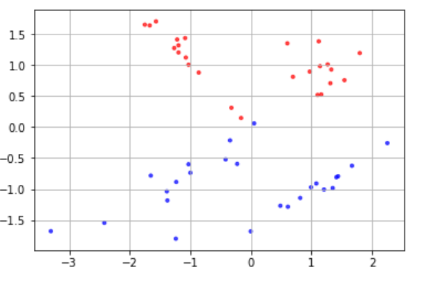
# モジュールのimport from sklearn.datasets import make_classification # プロット用モジュール import matplotlib.pyplot as plt import matplotlib %matplotlib inline # コード # データX, ラベルyを生成 X, y = make_classification(n_samples=50, n_features=2, n_redundant=0, random_state=0) # データの色付け、プロット plt.scatter(X[:, 0], X[:, 1], c=y, marker='.', cmap=matplotlib.cm.get_cmap(name='bwr'), alpha=0.7) plt.grid(True) |
|
1 2 3 |
他にも引数はありますが、この章ではこれらを定義したデータを作成していきます。 また、データがどのクラスに属しているかを示す「ラベル(y)」が用意されますが、基本的に整数値によってラベルを用意します。 例えば二項分類であれば各データのラベルは「0」または「1」になります。 |
|
1 2 3 4 5 6 7 8 9 10 11 12 |
import matplotlib.pyplot as plt %matplotlib inline data = [60, 20, 10, 5, 3, 2] labels = ['Apple', 'Orange', 'Banana', 'Pineapple', 'Kiwifruit', 'Strawberry'] explode = [0, 0, 0.1, 0, 0, 0] # dataにlabelsのラベルをつけて、Bananaを目立たせた円グラフ可視化 plt.pie(data, labels=labels, explode=explode) plt.axis('equal') plt.show() |
explodeは目立たせたい円グラフを0から1までの値でグラフから飛びだたせる