• Skip to main content
  • Skip to primary sidebar

学習記録

グラフ

散布図

2017年12月6日 by 河副 太智 Leave a Comment

1
2
3
4
5
6
7
8
9
10
11
12
import numpy as np
import matplotlib.pyplot as plt
%matplotlib inline
 
 
np.random.seed(0)
x = np.random.choice(np.arange(100), 100)
y = np.random.choice(np.arange(100), 100)
 
# マーカー色を設定して散布図を作成
plt.scatter(x, y, marker="s", color="r")
plt.show()
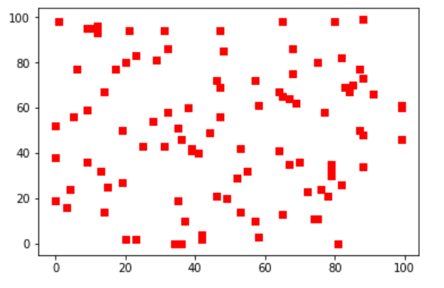


マーカー (,marker=”o”)

  • "o": 円
  • "s": 四角
  • "p": 五角形
  • "*": 星
  • "+": プラス
  • "D": ダイアモンド

色 (markerfacecolor=”r”)

  • "b" : 青
  • "g" : 緑
  • "r" : 赤
  • "c" : シアン
  • "m" : マゼンタ
  • "y" : 黄色
  • "k" : 黒
  • "w" : 白

Filed Under: グラフ

棒グラフ、ヒストグラム

2017年12月6日 by 河副 太智 Leave a Comment

1
2
3
4
5
6
7
8
9
10
11
import numpy as np
import matplotlib.pyplot as plt
%matplotlib inline
 
 
np.random.seed(0)
data = np.random.randn(10000)
 
# 正規化されたビン数100のヒストグラムを作成
plt.hist(data, bins=100, normed=True)
plt.show()


bins=xで任意の数の階級に分け、autoはランダム
normedは正規化
cumulativeは累積ヒストグラム


Filed Under: グラフ

線グラフ

2017年12月5日 by 河副 太智 Leave a Comment

グラフのプロット

1
2
3
4
5
6
7
8
9
10
11
12
import matplotlib.pyplot as plt
import numpy as np
# jupyterてグラフを表示する
%matplotlib inline
 
 
x = np.linspace(0, np.pi)
y = np.sin(x)
 
# データx,yをグラフにプロット
plt.plot(x,y)
plt.show()


線グラフの表示方法
1
2
3
4
5
6
7
8
9
10
11
12
13
14
15
import numpy as np
import matplotlib.pyplot as plt
%matplotlib inline
 
 
days = np.arange(1, 11)
weight = np.array([10, 14, 18, 20, 18, 16, 17, 18, 20, 17])
# 表示の設定
plt.ylim([0, weight.max()+1])
plt.xlabel("days")
plt.ylabel("weight")
 
# 円マーカーを赤色でプロットし、青の破線の折れ線グラフを作成
plt.plot(days, weight, linestyle="--", color="b", marker="o", markerfacecolor="r")
plt.show()


マーカー (,marker=”o”)

  • "o": 円
  • "s": 四角
  • "p": 五角形
  • "*": 星
  • "+": プラス
  • "D": ダイアモンド

色 (markerfacecolor=”r”)

  • "b" : 青
  • "g" : 緑
  • "r" : 赤
  • "c" : シアン
  • "m" : マゼンタ
  • "y" : 黄色
  • "k" : 黒
  • "w" : 白

線のスタイル  (linestyle=”–“)

  • "-": 実線
  • "--": 破線
  • "-.": 破線(点入り)
  • ":": 点線

Filed Under: グラフ

  • « Go to Previous Page
  • Page 1
  • Page 2
  • Page 3
  • Page 4

Primary Sidebar

カテゴリー

  • AWS
  • Bootstrap
  • Dash
  • Django
  • flask
  • GIT(sourcetree)
  • Plotly/Dash
  • VPS
  • その他tool
  • ブログ
  • プログラミング
    • Bokeh
    • css
    • HoloViews
    • Jupyter
    • Numpy
    • Pandas
    • PosgreSQL
    • Python 基本
    • python3
      • webアプリ
    • python3解説
    • scikit-learn
    • scipy
    • vps
    • Wordpress
    • グラフ
    • コマンド
    • スクレイピング
    • チートシート
    • データクレンジング
    • ブロックチェーン
    • 作成実績
    • 時系列分析
    • 機械学習
      • 分析手法
      • 教師有り
    • 異常値検知
    • 自然言語処理
  • 一太郎
  • 数学
    • sympy
      • 対数関数(log)
      • 累乗根(n乗根)
    • 暗号学

Copyright © 2025 · Genesis Sample on Genesis Framework · WordPress · Log in