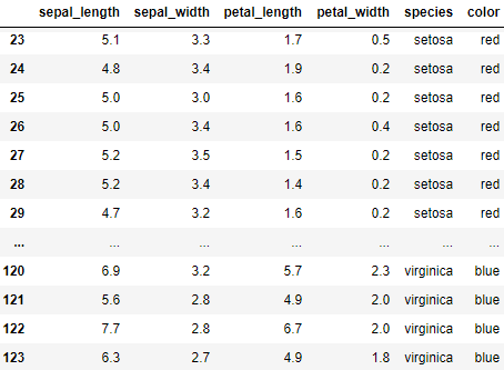
• Skip to main content
  • Skip to primary sidebar

学習記録

Bokeh

さくらvpsにflaskを入れてwebapp作成

2018年8月10日 by 河副 太智 Leave a Comment

rootログイン

FTPでのファイル転送はrootで行う為に以下のサイトを参考

Ubuntu 16.04: rootでログインする

ソフトウェアのインストール

– Go to the server root directory with “cd /”
– yumでInstall required software with
“yum install python-virtualenv nginx gunicorn supervisor python-pip”

– apt-getでInstall required software with “
apt-get install python-virtualenv nginx gunicorn supervisor python-pip


ディレクトリの作成

– Create a new directory for the virtual environment with
“mkdir /opt/envs”

– Create a virtual environment with virtualenv
“virtualenv /opt/envs/virtual”

– Activate the virtual environment
“. /opt/envs/virtual/bin/activate”

– Install Python dependencies
“pip install bokeh”
“pip install flask”
“pip install gunicorn”

– Create a new directory inside the nginx server
“mkdir /var/log/nginx/flask”

– Create a new directory for uploading app files
“mkdir /opt/webapps” “mkdir /opt/webapps/bokehflask”


configuration filesの作成

– Make sure you have your configuration files ready
which are bokeh_serve.conf, flask.conf and default.


FTPアップロード

– Locate your local project directory on the left panel and select your
Python files and the templates directory or any other associated local directory,
but not configuration files

– Locate and select the server directory on the right panel and click Upload
/opt/webapps/bokehflaskにapp.pyとrandom_generator.pyをアップする


– Upload the file named “default” to
/etc/nginx/sites-available
using the same procedure

– Upload files
“bokeh_serve.conf”
and
“flask.conf”
to /etc/supervisor/conf.d using the same procedure

サーバー上での調整

–  app.py を編集

以下のコマンドで開く
“nano /opt/webapps/bokehflask/app.py”

– インポート文を追加
“from werkzeug.contrib.fixers import ProxyFix”
to the remote app.py file.

– Modify the index function as follows:

1
2
3
4
5
def index():
    url="http://104.236.40.212:5006"
    session=pull_session(url=url,app_path="/random_generator")
    bokeh_script=autoload_server(None,app_path="/random_generator",session_id=session.id, url=url)
    return render_template("index.html", bokeh_script=bokeh_script)

– Add “app.wsgi_app = ProxyFix(app.wsgi_app)” to the remote app.py file after the index function.
– Save the file by pressing Control-X, then type y and then hit Enter.

–  bokeh_serve.confを編集

以下のコマンドで開く
“nano /etc/supervisor/conf.d/bokeh_serve.conf”
and put your IP for –allow-websocket-origin and your IP and port 5006 for –host


実行

– Start the nginx webserver with
“service nginx restart”

– Start supervisor with
“service supervisor restart”

– Start flask with
“supervisorctl restart flask”

– Start bokeh server with
“supervisorctl restart bokeh_serve”

– Visit your app in the browswer at http://160.16.225.109 (put your own IP)

Filed Under: Bokeh, flask

Bokehサーバーで使用したコマンドライン

2018年7月22日 by 河副 太智 Leave a Comment

pyファイルを実行
※http://localhost:5006/widgetsと表示されるのでブラウザからアクセス

1
C:\Users\Myname\Myfolder>python -m bokeh serve 〇〇.py

1
C:\Users\Myname\Myfolder>bokeh serve 〇〇.py

ポート番号を指定して実行
※5007の部分は任意で指定できる

1
C:\Users\Myname\jupyter_notebook>bokeh serve widgets.py --port 5007


実行したコマンドラインの停止は ctrl + C

Filed Under: Bokeh, プログラミング

Bokehサーバーでインタラクティブなグラフアプリを作る

2018年7月20日 by 河副 太智 Leave a Comment

インタラクティブなグラフをwebアプリで公開するには
Bokehサーバーを使用する必要があります。

今回はBokehサーバーを利用したweb上で表示して
ユーザーがいじる事ができるインタラクティブグラフの作成方法を紹介します。


まずはインポート

1
2
3
4
5
6
7
8
#アウトプットと別画面表示
from bokeh.io import output_file, show
 
#ユーザーが入力できるテキスト、ボタン、パラグラフウィジェット
from bokeh.models.widgets import TextInput, Button, Paragraph
 
#レイアウトをアレンジするオブジェクト
from bokeh.layouts import layout


とりあえず何かそれっぽいhtmlファイルを生成

1
2
3
4
5
6
7
8
9
10
11
12
#html出力 Bokehサーバー使用時には不要なので後で削除します。
output_file("bokehserver1.html")
 
#テキスト入力フォームとボタン
text_input=TextInput(value="ABC")
button=Button(label="ボタンText")
 
#テキスト、ボタンのウィジェットを指定
lay_out=layout([[button,text_input]])
 
#表示 こちらもBokehサーバー使用時には不要なので後で削除します。
show(lay_out)


実行結果
何かができました(笑)
ボタンもあればテキスト入力フォームも動いています。


この時点ではまだBokehサーバーにはつながっておりませんので
何も動作はしません。

上記のコードは違いを理解する為だけにありますので
実際はhtmlのアウトプットやshowメソッドは不要です。

では実際にBokehサーバーを使用して動くようにしてみます。

動的にテキストを変化させる為にcurdocオブジェクトを使用します。

1
2
#curdocをインポート
from bokeh.io import curdoc

ボタンを押した際に発生するアクションを設定

1
2
3
4
5
6
def update():
    output.text="Hello," + text_input.value
 
button.on_click(update)
 
curdoc().add_root(lay_out)


上記2つを元のコードに合わせると以下のようになります。


コード

1
2
3
4
5
6
7
8
9
10
11
12
13
14
15
16
17
from bokeh.io import curdoc
from bokeh.models.widgets import TextInput, Button, Paragraph
from bokeh.layouts import layout
 
text_input=TextInput(value="AAA")
button=Button(label="Text")
output=Paragraph()
 
def update():
    output.text="Hello," + text_input.value
 
button.on_click(update)
 
# button.on_click(update)
lay_out=layout([[button,text_input],[output]])
 
curdoc().add_root(lay_out)


エディターで上記コードをwidget.pyという名前で保存し、
コマンドラインから実行します。

例:
C:\Users\xxxx>bokeh serve widgets.py

すると以下のようにlocalhostのアドレスが出てきます
2018-07-21 22:54:49,162 Bokeh app running at: http://localhost:5006/widgets

ブラウザにhttp://localhost:5006/widgetsを打ち込むと先ほどの動かなかった
webアプリが動くようになります。


以下は元素データから取得した元素ごとの沸点を表示するグラフのコードです。

1
2
3
4
5
6
7
8
9
10
11
12
13
14
15
16
17
18
19
20
21
22
23
24
25
26
27
28
29
30
31
32
33
34
35
36
37
38
39
40
41
42
43
44
45
46
47
48
49
50
51
52
53
54
55
56
57
58
59
60
61
62
63
64
65
66
67
68
69
70
71
72
73
74
75
76
77
78
79
80
81
82
83
84
85
86
87
88
#ライブラリーのインポート
from bokeh.plotting import figure
from bokeh.io import curdoc
from bokeh.sampledata.periodic_table import elements
from bokeh.models import Range1d, PanTool, ResetTool, HoverTool, ColumnDataSource, LabelSet, Select
from bokeh.models.annotations import Span, BoxAnnotation, Label, LabelSet
from bokeh.layouts import layout
 
#N/Aを含む行を削除する118あった行が31個まで減る
elements.dropna(inplace=True)
#辞書を使用してガスは黄色というように記憶させる
colormap={'gas':'yellow','liquid':'orange','solid':'red'}
#elementsのデータフレームに色(color)のカラムを追加しつつカラムstandard stateにある値に対する色を入れていく
elements['color']=[colormap[x] for x in elements['standard state']]
 
#データフレームのままだと柔軟に動かせないのでカラムデータソースに3つに分けて入れる
gas=ColumnDataSource(elements[elements["standard state"]=="gas"])
liquid=ColumnDataSource(elements[elements['standard state']=='liquid'])
solid=ColumnDataSource(elements[elements['standard state']=='solid'])
 
#figureオブジェクトを作成
f=figure()
 
#glyphの作成 無地のグラフに一本ずつグラフの線を追加していく
#今回は丸で表すのせcircle()を追加し、その色やサイズを指定していく
f.circle(x="atomic radius",y="boiling point",#x軸を原子のサイズ、y軸を沸点に指定
         size=[i/10 for i in gas.data["van der Waals radius"]],#sizeカラムを作り、そこに半径の1/10の数値を入れる
         fill_alpha=0.2,color="color",legend="Gas",source=gas)#colorは先程追加したカラムを参照するので""で指定、sourceはカラムデータソースの変数なので""はつかない
#以下もう2本のグラフを追加する
f.circle(x="atomic radius", y="boiling point",
         size=[i/10 for i in liquid.data["van der Waals radius"]],
         fill_alpha=0.2,color="color",legend='Liquid',source=liquid)
 
f.circle(x="atomic radius", y="boiling point",
         size=[i/10 for i in solid.data["van der Waals radius"]],
         fill_alpha=0.2,color="color",legend='Solid',source=solid)
 
#x軸y軸に名前を付ける
f.xaxis.axis_label="Atomic radius"
f.yaxis.axis_label="Boiling point"
 
 
#各要素(3つ分)の沸点の平均を計算する、sumでカラム内要素を足してlenで取得したカラム内項目数で割る
gas_average_boil=sum(gas.data["boiling point"])/len(gas.data["boiling point"])
liquid_average_boil=sum(liquid.data["boiling point"])/len(liquid.data["boiling point"])
solid_average_boil=sum(solid.data["boiling point"])/len(solid.data["boiling point"])
 
#沸点の最低値と最高値を取得
solid_min_boil=min(solid.data["boiling point"])
solid_max_boil=max(solid.data["boiling point"])
 
 
#各要素(3つ分)の平均値に目印となる(Spanと呼ぶ)色付きの線を設定する
#これら平均値を表す目印はユーザーの指定によって変化する
span_gas_average_boil=Span(location=gas_average_boil,dimension="width",line_color="yellow",line_width=2)
span_liquid_average_boil=Span(location=liquid_average_boil, dimension='width',line_color='orange',line_width=2)
span_solid_boil=Span(location=solid_average_boil, dimension='width',line_color='red',line_width=2)
 
#上記で設定した平均値を表す目印をfigure()オブジェクトに追加する
#無地のグラフに一本ずつグラフの線を追加していく作業を先ほど行ったのでここに更に足す形になる
f.add_layout(span_gas_average_boil)
f.add_layout(span_liquid_average_boil)
f.add_layout(span_solid_boil)


#span_solid_boilの位置に関する値をアップデートする自作関数を設定
#select.valueから帰ってくる値はstringとなっているのでfloatに変換する必要がある
def update_span(attr, old, new):
    span_solid_boil.location=float(select.value)
 
 
#変数optionの中にリスト形式でデータから取得した値とそれを説明する文字列をタプルのペアで入れる
#データから取得した値はstringに変換する必要がある
options=[
(str(solid_average_boil),"Solid Average Boiling Point"),
(str(solid_min_boil),"Solid Minimum Boiling Point"),
(str(solid_max_boil),"Solid Maximum Boiling Point")]
 
#選択ウィジェットを作成
select=Select(title="Select span value", options=options)
select.on_change("value",update_span)
 
 
#選択ウィジェットの配置と有効化
lay_out=layout([[select]])
curdoc().add_root(f)
curdoc(.add_root(lay_out))


Filed Under: Bokeh

Bokehでのデータ可視化コピペ用サンプル

2018年6月3日 by 河副 太智 Leave a Comment

Bokehでデータ可視化の方法を簡単なものから順に紹介していきます。


リストの値から線グラフ

単純にリストに入ったデータをプロットして
可視化したグラフをLine.htmlという名でhtmlファイルでアウトプットします。


コード

リストの値を線グラフにする
1
2
3
4
5
6
7
8
9
10
11
12
13
14
15
16
17
18
from bokeh.plotting import figure
from bokeh.io import output_file, show
 
 
x = [1,2,3,4,5]
y = [6,7,8,9,10]
 
#HTMLファイル名を指定
output_file("Line.html")
 
#オブジェクトを指定
f = figure()
 
#x,yの値を線グラフに
f.line(x,y)
 
#別ページにてHTMLファイルを開く
show(f)


実行結果


csvファイルからのデータをプロット

csvファイルから表示したいデータのカラムを指定する。


今回はYearとEngineeringのデータだけを指定


1
2
3
df=pandas.read_csv("bachelors.csv")
x = df["Year"]
y = df["Engineering"]


コード

1
2
3
4
5
6
7
8
9
10
11
12
13
14
15
16
17
18
19
20
21
22
23
#Making a basic Bokeh line graph
 
#importing bokeh and pandas
from bokeh.plotting import figure
from bokeh.io import output_file, show
import pandas
 
#prepare some data
df=pandas.read_csv("bachelors.csv")
x = df["Year"]
y = df["Engineering"]
 
# #prepare the output file
output_file("aaa.html")
 
# #create a figure object
f = figure()
dir(f)
#create line plot
f.line(x,y)
 
#write the plot in the figure object
show(f)


実行結果


※HTMLファイルを出力した後にコードの内容を変更して
再度HTMLファイルを生成すると元のコードに上書きされず、
二重にコードが書かれてHTML出力してしまうバグがあります。

その結果上記コードを実行する度にHTMLファイルの容量は重くなっていきますので
対処法として最後のコードのshow()は使わずにsave()で実行すれば
HTMLファイルが重くなる現象を防ぐことができます。

グラフのサイズと色を指定

今回使用するデータセットはbokehのサンプルデータにある”iris”を使用します。
花のガクと弁のサイズとそのサイズに対する学術名の一覧です。

以下のコードがbokehのサンプルデータをインポートする為のコードです。
インポートすれば”flowers”という文字列を使う事によってデータを使用できます。

1
from bokeh.sampledata.iris import flowers


実際にサンプルデータの中身を見てみます。

1
flowers


sepal_length sepal_width petal_length petal_width species
0 5.1 3.5 1.4 0.2 setosa
1 4.9 3.0 1.4 0.2 setosa
2 4.7 3.2 1.3 0.2 setosa
3 4.6 3.1 1.5 0.2 setosa
4 5.0 3.6 1.4 0.2 setosa
5 5.4 3.9 1.7 0.4 setosa
6 4.6 3.4 1.4 0.3 setosa
7 5.0 3.4 1.5 0.2 setosa
8 4.4 2.9 1.4 0.2 setosa
9 4.9 3.1 1.5 0.1 setosa
10 5.4 3.7 1.5 0.2 setosa
11 4.8 3.4 1.6 0.2 setosa
12 4.8 3.0 1.4 0.1 setosa
13 4.3 3.0 1.1 0.1 setosa
14 5.8 4.0 1.2 0.2 setosa
15 5.7 4.4 1.5 0.4 setosa
16 5.4 3.9 1.3 0.4 setosa
17 5.1 3.5 1.4 0.3 setosa
18 5.7 3.8 1.7 0.3 setosa
19 5.1 3.8 1.5 0.3 setosa
20 5.4 3.4 1.7 0.2 setosa
21 5.1 3.7 1.5 0.4 setosa
22 4.6 3.6 1.0 0.2 setosa
23 5.1 3.3 1.7 0.5 setosa
24 4.8 3.4 1.9 0.2 setosa
25 5.0 3.0 1.6 0.2 setosa
26 5.0 3.4 1.6 0.4 setosa
27 5.2 3.5 1.5 0.2 setosa
28 5.2 3.4 1.4 0.2 setosa
29 4.7 3.2 1.6 0.2 setosa
… … … … … …
120 6.9 3.2 5.7 2.3 virginica
121 5.6 2.8 4.9 2.0 virginica
122 7.7 2.8 6.7 2.0 virginica
123 6.3 2.7 4.9 1.8 virginica
124 6.7 3.3 5.7 2.1 virginica
125 7.2 3.2 6.0 1.8 virginica
126 6.2 2.8 4.8 1.8 virginica
127 6.1 3.0 4.9 1.8 virginica
128 6.4 2.8 5.6 2.1 virginica
129 7.2 3.0 5.8 1.6 virginica
130 7.4 2.8 6.1 1.9 virginica
131 7.9 3.8 6.4 2.0 virginica
132 6.4 2.8 5.6 2.2 virginica
133 6.3 2.8 5.1 1.5 virginica
134 6.1 2.6 5.6 1.4 virginica
135 7.7 3.0 6.1 2.3 virginica
136 6.3 3.4 5.6 2.4 virginica
137 6.4 3.1 5.5 1.8 virginica
138 6.0 3.0 4.8 1.8 virginica
139 6.9 3.1 5.4 2.1 virginica
140 6.7 3.1 5.6 2.4 virginica
141 6.9 3.1 5.1 2.3 virginica
142 5.8 2.7 5.1 1.9 virginica
143 6.8 3.2 5.9 2.3 virginica
144 6.7 3.3 5.7 2.5 virginica
145 6.7 3.0 5.2 2.3 virginica
146 6.3 2.5 5.0 1.9 virginica
147 6.5 3.0 5.2 2.0 virginica
148 6.2 3.4 5.4 2.3 virginica
149 5.9 3.0 5.1 1.8 virginica

150 rows × 5 columns


上記データをプロットします。

コード

1
2
3
4
5
6
7
8
9
10
11
12
13
14
15
16
17
18
19
20
21
22
23
24
25
26
27
28
29
from bokeh.plotting import figure
from bokeh.io import output_file, show
from bokeh.sampledata.iris import flowers#サンプルデータのインポート
 
output_file("iris.html")#HTMLファイル名を指定
 
f = figure()#オブジェクトの設定
 
f.plot_width=1100#グラフの横幅指定
f.plot_height=650#グラフの高さ設定
f.background_fill_color="olive"#バックグラウンドの色
f.background_fill_alpha=0.1#バックグラウンドの色の濃さ
f.border_fill_color="green"#ボーダーの色
 
 
f.title.text="Iris"#グラフのタイトル
f.title.text_color="olive"#タイトルの色
f.title.text_font="times"#タイトルのフォント(後程一覧を紹介します。)
f.title.text_font_size="25px"#フォントサイズ
f.title.align="center"#フォントの位置
 
f.xaxis.minor_rick_line_color="blue"#x軸の色を指定
f.yaxis.minor_label_orientation="vertical"#y軸の値を縦表示にする
 
#グラフの点を〇(丸)で表示するx=flowers["petal_length"]というのは
#サンプルデータのカラム"petal_length"のデータをxに代入し、プロットするという意味
f.circle(x=flowers["petal_length"], y=flowers["petal_width"])
 
show(f)


実行結果


上記の例ではボーダーカラーを緑に指定していますがボーダーカラーの色を変更できるという事実は
長いドキュメントを読まないとなかなか知る事はできません。

そこで

1
dir(f)

と入力するとfが設定できるプロパティ項目を一覧で取得できます。

上記コードを実行すると以下のようになります。

dir(f)でfに対する使用できるプロパティを検索してborder_fill_colorを見つけたので
ボーダーカラーも好きに変更できるという事がわかります。
dir()で自分の欲しいプロパティを探せば表現方法が広がりますので是非ご活用下さい。


色の設定一覧

f.background_fill_color=””
で指定できる色は様々な種類があります。

一覧を以下に紹介します


また、以下のように4つ目の数値に透明度の指定も可能です。

f.background_fill_color=(205,92,92,0.3)


フォントの設定一覧

上記コードにあるf.title.text_font=”times”
で指定できるフォントも色々あります。

一覧を以下に紹介します


軸の表示方法

以下に一例を挙げます。

1
2
3
f.xaxis.minor_rick_line_color="blue"#x軸の色を指定
f.yaxis.minor_label_orientation="vertical"#y軸の値を縦表示にする
f.xaxis.visible=False#x軸を非表示にする


日本語で軸のラベルを縦表示する場合は
f.yaxis.minor_label_orientation=”vertical”
を使用すれば綺麗に表示できるでしょう。


その他のプロパティは上記で紹介したプロパティの検索方法で
一覧を参照する事が出来ます。

1
dir(f.axis)

参照結果

dir()でプロパティ検索


minorというのはtickの小さい方でmajorは大きい方です。
これら2つを別々にいじる事が可能です。


x軸,y軸の目盛りの範囲を指定する

デフォルトではx軸のx軸の範囲は読み込んだデータの大きさによって変動しますが
この範囲を指定する事が可能です。

1
2
3
from bokeh.models import Range1d
f.x_range=Range1d(start=0,end=10)
f.y_range=Range1d(start=0,end=10)

Range1dをインポートして上記コードで開始と終わりの目盛りを指定すると
データの値に関係なく指定した目盛りを基準としたグラフができます。


Bokehのロゴを消す

ロゴを消したい場合は以下のコードで消すことが可能です。
目ざわりな場合は遠慮なく消しましょう

1
2
f=figure()
f.toolbar.logo=None


グラフ上で各情報を表示するHoverTool

以下のグラフは普通にデータプロットしただけですが

HoverToolを使用すれば以下のようにグラフ上のカーソルに合わせた際に
各データの情報詳細がポップアップ表示されます。


1
2
3
4
5
6
#HoverToolをインポート
from bokeh.models import HoverTool
 
#Toolを追加する
f = figure()
f.add_tools(HoverTool())


実行結果


コード

1
2
3
4
5
6
7
8
9
10
11
12
13
14
15
16
17
18
19
20
21
22
23
24
25
26
27
28
29
#Importing libraries
from bokeh.plotting import figure
from bokeh.io import output_file, show
from bokeh.sampledata.iris import flowers
from bokeh.models import Range1d, PanTool, ResetTool, HoverTool
 
#Define the output file path
output_file("iris5.html")
 
#Create the figure object
f = figure()
 
#Style the tools
f.tools = [PanTool(),ResetTool()]
f.add_tools(HoverTool())
f.toolbar_location = 'above'
f.toolbar.logo = None
 
#Style the plot area
f.plot_width = 500
f.plot_height = 300
f.background_fill_color = "olive"
f.background_fill_alpha = 0.3
 
 
f.circle(x=flowers["petal_length"], y=flowers["petal_width"])
 
 
show(f)


プロットサイズを変える

上記の散布図ではプロットのサイズ(図上の丸い点の大きさ)が一律です。
重要なプロットのサイズは大きく、そうでないものは小さくすると
非常に分かり易い散布図になります。

そこでsepal_widthの値によってプロットの大きさを変えてみます。


1
2
f.circle(x=flowers["petal_length"], y=flowers["petal_width"],
    size=flowers["sepal_width"]*4,fill_alpha=0.1)


size=flowers[“sepal_width”]*4
を追加しました、最後にサイズを4倍しているのはsepal_widthだけでは
差がわかりづらいからです。

また、末尾にfill_alpha=0.1がついております
これでプロットを半透明にしており、数値によって濃度を変える事が可能です。


実行結果


コード

1
2
3
4
5
6
7
8
9
10
11
12
13
14
15
16
17
18
19
20
21
22
23
24
25
26
27
28
29
#Importing libraries
from bokeh.plotting import figure
from bokeh.io import output_file, show
from bokeh.sampledata.iris import flowers
from bokeh.models import Range1d, PanTool, ResetTool, HoverTool
 
#Define the output file path
output_file("iris6.html")
 
#Create the figure object
f = figure()
 
#Style the tools
f.tools = [PanTool(),ResetTool()]
f.add_tools(HoverTool())
f.toolbar_location = 'above'
f.toolbar.logo = None
 
#Style the plot area
f.plot_width = 500
f.plot_height = 300
f.background_fill_color = "olive"
f.background_fill_alpha = 0.3
 
 
f.circle(x=flowers["petal_length"], y=flowers["petal_width"],
         size=flowers["sepal_width"]*4,fill_alpha=0.1)
 
show(f)


今回の例ではサイズによって大きさを変えておりますが
例えば金融系で使用するのであれば金額(値)が大きいものを大きく
小さいものを小さくというように応用が可能です。


プロットの色を変える

データセットには花の種類が3種類あります。
speciesのカラムに”setosa”,”versicolor”,”virginica”がありますので
それぞれに色を指定して、データセットにカラムを追加します。

1
2
colormap={"setosa":"red","versicolor":"green","virginica":"blue"}
flowers["color"]=[colormap[x] for x in flowers["species"]]


データセットの右端にcolorのカラムが追加され、それぞれの花の種類ごとに
色が追加されています。


“color=”で色を指定します。

1
2
f.circle(x=flowers["petal_length"], y=flowers["petal_width"],
     size=flowers["sepal_width"]*4,fill_alpha=0.1,color=flowers["color"])


実行結果


コード

1
2
3
4
5
6
7
8
9
10
11
12
13
14
15
16
17
18
19
20
21
22
23
24
25
26
27
28
29
30
31
32
33
34
35
36
37
38
39
from bokeh.plotting import figure
from bokeh.io import output_file, show
from bokeh.sampledata.iris import flowers
 
output_file("iris.html")
 
f = figure()
 
f.plot_width=1100
f.plot_height=650
f.background_fill_color="olive"
f.background_fill_alpha=0.1#バックグラウンドの色の濃さ


f.title.text="Iris"
f.title.text_color="olive"
f.title.text_font="times"
f.title.text_font_size="25px"
f.title.align="center"


f.xaxis.axis_label="Petal Length"
f.yaxis.axis_label="Petal Width"
 
 
from bokeh.models import Range1d
f.x_range=Range1d(start=0,end=7,bounds=(3,5))
f.y_range=Range1d(start=0,end=3)
f.xaxis.bounds=(2,5)
 
 
colormap={"setosa":"red","versicolor":"green","virginica":"blue"}
flowers["color"]=[colormap[x] for x in flowers["species"]]
 
f.circle(x=flowers["petal_length"], y=flowers["petal_width"],size=flowers["sepal_width"]*4,fill_alpha=0.1,color=flowers["color"])
 
show(f)


ColumnDataSourceを使う

データをColumnDataSourceを使用して表示すれば
様々な可視化テクニックを使用しやすくなります。
(例えばストリーミングデータ、プロット間のシェアリングデータ、フィルタリング等)

以下一般的なプロット用のコードです。

1
2
3
4
5
6
7
from bokeh.plotting import figure
 
x_values = [1, 2, 3, 4, 5]
y_values = [6, 7, 2, 3, 6]
 
p = figure()
p.circle(x=x_values, y=y_values)

ColumnDataSourceを使用して同じデータを表示

1
2
3
4
5
6
7
8
9
10
from bokeh.plotting import figure
from bokeh.models import ColumnDataSource
 
data = {'x_values': [1, 2, 3, 4, 5],
        'y_values': [6, 7, 2, 3, 6]}
 
source = ColumnDataSource(data=data)
 
p = figure()
p.circle(x='x_values', y='y_values', source=source)

上記両者はコードは異なりますが実行結果は同じです。


ColumnDataSourceの方がより高度な表現ができるので
今後はこの方法でグラフ作成していこうと思います。


今までのirisのデータセットをColumnDataSourceを使用して
読み込むには以下のように今までのコードを書き直します。


ColumnDataSourceをインポート

1
from bokeh.models import ColumnDataSource


花の種類別にそれぞれコードを書き直す

1
2
3
4
5
6
7
8
9
10
11
12
13
setosa = ColumnDataSource(flowers[flowers["species"]=="setosa"])
versicolor = ColumnDataSource(flowers[flowers["species"]=="versicolor"])
virginica = ColumnDataSource(flowers[flowers["species"]=="virginica"])
 
 
f.circle(x="petal_length", y="petal_width", size='size', fill_alpha=0.2,
color="color", line_dash=[5,3], legend='Setosa', source=setosa)
 
f.circle(x="petal_length", y="petal_width", size='size', fill_alpha=0.2,
color="color", line_dash=[5,3], legend='Versicolor', source=versicolor)
 
f.circle(x="petal_length", y="petal_width", size='size', fill_alpha=0.2,
color="color", line_dash=[5,3], legend='Virginica', source=virginica)


色の設定は上記コードの上部に移動させる

1
2
3
colormap={'setosa':'red','versicolor':'green','virginica':'blue'}
flowers['color'] = [colormap[x] for x in flowers['species']]
flowers['size'] = flowers['sepal_width'] * 4


実行結果


コード

1
2
3
4
5
6
7
8
9
10
11
12
13
14
15
16
17
18
19
20
21
22
23
24
25
26
27
28
29
30
31
32
33
34
35
36
37
38
39
40
41
#Importing libraries
from bokeh.plotting import figure
from bokeh.io import output_file, show
from bokeh.sampledata.iris import flowers
from bokeh.models import Range1d, PanTool, ResetTool, HoverTool, ColumnDataSource, LabelSet, HoverTool
 
colormap={'setosa':'red','versicolor':'green','virginica':'blue'}
flowers['color'] = [colormap[x] for x in flowers['species']]
flowers['size'] = flowers['sepal_width'] * 4
 
setosa = ColumnDataSource(flowers[flowers["species"]=="setosa"])
versicolor = ColumnDataSource(flowers[flowers["species"]=="versicolor"])
virginica = ColumnDataSource(flowers[flowers["species"]=="virginica"])
 
#Define the output file path
output_file("iris9.html")
 
#Create the figure object
f = figure()
f.add_tools(HoverTool())
#adding glyphs
f.circle(x="petal_length", y="petal_width", size='size', fill_alpha=0.2,
color="color", line_dash=[5,3], legend='Setosa', source=setosa)
 
f.circle(x="petal_length", y="petal_width", size='size', fill_alpha=0.2,
color="color", line_dash=[5,3], legend='Versicolor', source=versicolor)
 
f.circle(x="petal_length", y="petal_width", size='size', fill_alpha=0.2,
color="color", line_dash=[5,3], legend='Virginica', source=virginica)
 
 
#Style the plot area
f.plot_width = 500
f.plot_height = 300
f.background_fill_color = "olive"
f.background_fill_alpha = 0.3


#Save and show the figure
show(f)


ポップアップの指定

グラフ上にカーソルを合わせると個別のデータの詳細が
ポップアップで表示されますが、デフォルトだとゴチャゴチャしてしまうので
欲しい情報だけをポップアップに表示する方法を紹介します。

例えばspeciesとsepal_widthのデータだけをポップアップに表示させるには
以下のコードを追加します。

1
2
f.add_tools(hover)
hover = HoverTool(tooltips=[("Species","@species"), ("Sepal Width", "@sepal_width")])

上記コードはpandasで読み込んだデータには対応しておりません。
pandasのデータのまま行うとポップアップ表示が”???”になってしまいますので
上記コードを使用する際はデータをColumnDataSourceに入れなおす必要があります。


以下デフォルトのグラフ

以下ポップアップにspeciesとsepal_widthのデータを指定したグラフ

コード

1
2
3
4
5
6
7
8
9
10
11
12
13
14
15
16
17
18
19
20
21
22
23
24
25
26
27
28
29
30
31
32
33
34
35
36
37
38
39
40
41
42
43
44
45
46
47
#Importing libraries
from bokeh.plotting import figure
from bokeh.io import output_file, show
from bokeh.sampledata.iris import flowers
from bokeh.models import Range1d, PanTool, ResetTool, HoverTool, ColumnDataSource, LabelSet, HoverTool
 
colormap={'setosa':'red','versicolor':'green','virginica':'blue'}
flowers['color'] = [colormap[x] for x in flowers['species']]
flowers['size'] = flowers['sepal_width'] * 4
 
setosa = ColumnDataSource(flowers[flowers["species"]=="setosa"])
versicolor = ColumnDataSource(flowers[flowers["species"]=="versicolor"])
virginica = ColumnDataSource(flowers[flowers["species"]=="virginica"])
 
#Define the output file path
output_file("iris11.html")
 
#Create the figure object
f = figure()
 
# f.add_tools(HoverTool())
f.add_tools(hover)
hover = HoverTool(tooltips=[("Species","@species"), ("Sepal Width", "@sepal_width")])


#adding glyphs
f.circle(x="petal_length", y="petal_width", size='size', fill_alpha=0.2,
color="color", line_dash=[5,3], legend='Setosa', source=setosa)
 
f.circle(x="petal_length", y="petal_width", size='size', fill_alpha=0.2,
color="color", line_dash=[5,3], legend='Versicolor', source=versicolor)
 
f.circle(x="petal_length", y="petal_width", size='size', fill_alpha=0.2,
color="color", line_dash=[5,3], legend='Virginica', source=virginica)
 
 
#Style the plot area
f.plot_width = 500
f.plot_height = 300
f.background_fill_color = "olive"
f.background_fill_alpha = 0.3


#Save and show the figure
show(f)


ポップアップをHTMLで操作

上記で使用したHoverToolはHTMLを使用して表示内容をカスタマイズできます。
コードは以下のようになります。

1
2
3
4
5
6
7
8
9
10
11
hover = HoverTool(tooltips="""
     <div>
            <div>
                <span style="font-size: 15px; font-weight: bold;">@species</span>
            </div>
            <div>
                <span style="font-size: 10px; color: #696;">Petal length: @petal_length</span><br>
                <span style="font-size: 10px; color: #696;">Petal width: @petal_width</span>
            </div>
        </div>
""")


更にHTMLが使えるのであればポップアップに画像を埋め込む事も可能です。
今回の例ではWikipediaから取得した3種類の花の画像を、
それぞれのポップアップウィンドウに表示させてみましょう


まずはurlmap辞書を作成し、各種類の花に対し、画像のurlを渡し、
次に画像用のカラムimgsを作成し、データセットに追加します。

1
2
3
4
5
6
7
#urlmapを作成、各種の花のデータに対し対応する画像urlを渡す
urlmap = {'setosa':'https://upload.wikimedia.org/wikipedia/commons/thumb/5/56/Kosaciec_szczecinkowaty_Iris_setosa.jpg/800px-Kosaciec_szczecinkowaty_Iris_setosa.jpg',
        'versicolor':'https://upload.wikimedia.org/wikipedia/commons/thumb/2/27/Blue_Flag%2C_Ottawa.jpg/800px-Blue_Flag%2C_Ottawa.jpg',
        'virginica':'https://upload.wikimedia.org/wikipedia/commons/thumb/9/9f/Iris_virginica.jpg/800px-Iris_virginica.jpg'}
 
#imgのカラムを作成しデータセットに追加
flowers['imgs'] = [urlmap[x] for x in flowers['species']]


実行結果↓カーソルを合わせるとデータの詳細と画像が表示されます。


コード

1
2
3
4
5
6
7
8
9
10
11
12
13
14
15
16
17
18
19
20
21
22
23
24
25
26
27
28
29
30
31
32
33
34
35
36
37
38
39
40
41
42
43
44
45
46
47
48
49
50
51
52
53
54
55
56
57
58
59
60
61
62
63
64
65
66
67
68
69
70
71
#Importing libraries
from bokeh.plotting import figure
from bokeh.io import output_file, show
from bokeh.sampledata.iris import flowers
from bokeh.models import Range1d, PanTool, ResetTool, HoverTool, ColumnDataSource, LabelSet, HoverTool
 
colormap={'setosa':'red','versicolor':'green','virginica':'blue'}
flowers['color'] = [colormap[x] for x in flowers['species']]
flowers['size'] = flowers['sepal_width'] * 4
 
 
urlmap = {'setosa':'https://upload.wikimedia.org/wikipedia/commons/thumb/5/56/Kosaciec_szczecinkowaty_Iris_setosa.jpg/800px-Kosaciec_szczecinkowaty_Iris_setosa.jpg',
        'versicolor':'https://upload.wikimedia.org/wikipedia/commons/thumb/2/27/Blue_Flag%2C_Ottawa.jpg/800px-Blue_Flag%2C_Ottawa.jpg',
        'virginica':'https://upload.wikimedia.org/wikipedia/commons/thumb/9/9f/Iris_virginica.jpg/800px-Iris_virginica.jpg'}
flowers['imgs'] = [urlmap[x] for x in flowers['species']]
 
 
setosa = ColumnDataSource(flowers[flowers["species"]=="setosa"])
versicolor = ColumnDataSource(flowers[flowers["species"]=="versicolor"])
virginica = ColumnDataSource(flowers[flowers["species"]=="virginica"])
 
#Define the output file path
output_file("iris12.html")
 
#Create the figure object
f = figure()
 
#Style the tools
f.tools = [PanTool(),ResetTool()]
hover = HoverTool(tooltips="""
     <div>
            <div>
                <img
                    src="@imgs" height="42" alt="@imgs" width="42"
                    style="float: left; margin: 0px 15px 15px 0px;"
                    border="2"
                ></img>
            </div>
            <div>
                <span style="font-size: 15px; font-weight: bold;">@species</span>
            </div>
            <div>
                <span style="font-size: 10px; color: #696;">Petal length: @petal_length</span><br>
                <span style="font-size: 10px; color: #696;">Petal width: @petal_width</span>
            </div>
        </div>
""")
f.add_tools(hover)
 
 
#adding glyphs
f.circle(x="petal_length", y="petal_width", size='size', fill_alpha=0.2,
color="color", line_dash=[5,3], legend='Setosa', source=setosa)
 
f.circle(x="petal_length", y="petal_width", size='size', fill_alpha=0.2,
color="color", line_dash=[5,3], legend='Versicolor', source=versicolor)
 
f.circle(x="petal_length", y="petal_width", size='size', fill_alpha=0.2,
color="color", line_dash=[5,3], legend='Virginica', source=virginica)
 
 
#Style the plot area
f.plot_width = 500
f.plot_height = 300
f.background_fill_color = "olive"
f.background_fill_alpha = 0.3


#Save and show the figure
show(f)


周期表データを可視化

今までの内容を応用してbokehにデフォルトで入っている
周期表データを可視化してみます。

以下のコードで周期表のデータ入手ができます。

1
from bokeh.sampledata.periodic_table import elements


データセットの中身を確認

1
elements


x軸に”atomic radius”y軸に”boiling point”を取り
各元素の通常の状態「気体、液体、個体」の3種類に
それぞれ「赤、オレンジ、黄色」を指定し
ColumnDataSourceを使用してプロットします。


データセットのカラムに”standard state”があり、
各元素ごとの常温状態があります。(solid,liquid,gas,N/A)
solidを赤に、liquidをオレンジに、gasを黄色に、N/Aを削除します。


1
2
3
4
5
6
7
8
#NAは省く
elements.dropna(inplace=True)
#colormap辞書に色を指定
colormap={'solid':'red','liquid':'orange','gas':'yellow'}
#データセットに"color"を追加
elements['color'] = [colormap[x] for x in elements['standard state']]
#データセットにプロットの為のサイズを追加
elements['size'] = elements['van der Waals radius'] / 10


実行結果


コード

1
2
3
4
5
6
7
8
9
10
11
12
13
14
15
16
17
18
19
20
21
22
23
24
25
26
27
28
29
30
31
32
33
34
35
36
37
38
39
40
41
42
43
44
45
#Importing libraries
from bokeh.plotting import figure
from bokeh.io import output_file, show
from bokeh.sampledata.periodic_table import elements
from bokeh.models import Range1d, PanTool, ResetTool, HoverTool, ColumnDataSource, LabelSet, HoverTool
 
elements.dropna(inplace=True)
colormap={'solid':'red','liquid':'orange','gas':'yellow'}
elements['color'] = [colormap[x] for x in elements['standard state']]
elements['size'] = elements['van der Waals radius'] / 10
 
solid = ColumnDataSource(elements[elements['standard state']=="solid"])
liquid = ColumnDataSource(elements[elements['standard state']=="liquid"])
gas = ColumnDataSource(elements[elements['standard state']=="gas"])
 
 
# #Define the output file path
output_file("periodic.html")
 
# #Create the figure object
f = figure()
f.add_tools(HoverTool())
# f.add_tools(HoverTool())
#adding glyphs
f.circle(x="atomic radius", y="boiling point", size='size', fill_alpha=0.2,
color="color", line_dash=[5,3], legend='Solid', source=solid)
 
f.circle(x="atomic radius", y="boiling point", size='size', fill_alpha=0.2,
color="color", line_dash=[5,3], legend='Liquid', source=liquid)
 
f.circle(x="atomic radius", y="boiling point", size='size', fill_alpha=0.2,
color="color", line_dash=[5,3], legend='Gas', source=gas)
 
 
# #Style the plot area
# f.plot_width = 500
# f.plot_height = 300
# f.background_fill_color = "olive"
# f.background_fill_alpha = 0.3
 
f.xaxis.axis_label="Atomic radius"
f.yaxis.axis_label="Boiling point"
 
# #Save and show the figure
show(f)


複数のグラフを表示

今までの例では一つのグラフに3つのデータを重ねて表示しました。
次は3つのデータを個別に小さなグラフに分けて表示する方法です。
花の種類に合わせてf1,f2,f3の3種類に分けてグラフのサイズを指定します。

1
2
3
f1 = figure(width=250,plot_height=250,title="Setosa")
f2 = figure(width=250,plot_height=250,title="Versicolor")
f3 = figure(width=250,plot_height=250,title="Virginica")

さらに3つのグラフにデータを結び付けます

1
2
3
4
5
6
7
8
f1.circle(x="petal_length", y="petal_width", size='size', fill_alpha=0.2,
color="color", line_dash=[5,3], legend='Setosa', source=setosa)
 
f2.circle(x="petal_length", y="petal_width", size='size', fill_alpha=0.2,
color="color", line_dash=[5,3], legend='Versicolor', source=versicolor)
 
f3.circle(x="petal_length", y="petal_width", size='size', fill_alpha=0.2,
color="color", line_dash=[5,3], legend='Virginica', source=virginica)


実行結果


コード

1
2
3
4
5
6
7
8
9
10
11
12
13
14
15
16
17
18
19
20
21
22
23
24
25
26
27
28
29
30
31
32
33
34
35
36
37
38
from bokeh.io import output_file,show
from bokeh.plotting import figure
from bokeh.sampledata.iris import flowers
from bokeh.models import Range1d, PanTool, ResetTool, HoverTool, ColumnDataSource, LabelSet, HoverTool
from bokeh.layouts import gridplot#複数のグラフを作成する為にインポート
 
output_file("gridplot2.html")
 
 
colormap={'setosa':'red','versicolor':'green','virginica':'blue'}
flowers['color'] = [colormap[x] for x in flowers['species']]
flowers['size'] = flowers['sepal_width'] * 4
 
 
setosa = ColumnDataSource(flowers[flowers["species"]=="setosa"])
versicolor = ColumnDataSource(flowers[flowers["species"]=="versicolor"])
virginica = ColumnDataSource(flowers[flowers["species"]=="virginica"])
 
f1 = figure(width=250,plot_height=250,title="Setosa")
f2 = figure(width=250,plot_height=250,title="Versicolor")
f3 = figure(width=250,plot_height=250,title="Virginica")


f1.circle(x="petal_length", y="petal_width", size='size', fill_alpha=0.2,
color="color", line_dash=[5,3], legend='Setosa', source=setosa)
 
f2.circle(x="petal_length", y="petal_width", size='size', fill_alpha=0.2,
color="color", line_dash=[5,3], legend='Versicolor', source=versicolor)
 
f3.circle(x="petal_length", y="petal_width", size='size', fill_alpha=0.2,
color="color", line_dash=[5,3], legend='Virginica', source=virginica)


f=gridplot([[f1,f2],[None,f3]])
 
show(f)


アノテーションを入れる

アノテーションとは以下のようにグラフ内の指定の位置に任意にマークする事です。


上記左側のグラフSetosaはx軸1.4の位置に縦に緑のマークが追加されています。
コードは以下のようになります。

1
2
span_1=Span(location=1.4,dimension="height",line_color="green",line_width=2)
f1.add_layout(span_1)

locationでアノテーションを置く位置を決めて後はお好みでデザインし、
次にf1に対し、add_layoutで設定したアノテーションのデザインを追加します。


また、上記右側のグラフVersicolorの方は特定の範囲に対して
ボックス型のアノテーションを設定しております。
コードは以下のようになります。

1
2
box_1=BoxAnnotation(left=3.5,right=4.5,fill_color="blue",fill_alpha=0.3)
f2.add_layout(box_1)

leftとrightで幅を決め、その範囲全体をボックス型のアノテーションが覆います。


実行結果


コード

1
2
3
4
5
6
7
8
9
10
11
12
13
14
15
16
17
18
19
20
21
22
23
24
25
26
27
28
29
30
31
32
33
34
35
36
37
38
39
40
41
42
43
44
45
46
from bokeh.io import output_file,show
from bokeh.plotting import figure
from bokeh.sampledata.iris import flowers
from bokeh.models import Range1d, PanTool, ResetTool, HoverTool, ColumnDataSource, LabelSet, HoverTool
from bokeh.layouts import gridplot#複数のグラフを作成する為にインポート
from bokeh.models.annotations import Span,BoxAnnotation
 
output_file("gridplot3.html")
 
 
colormap={'setosa':'red','versicolor':'green','virginica':'blue'}
flowers['color'] = [colormap[x] for x in flowers['species']]
flowers['size'] = flowers['sepal_width'] * 4
 
 
setosa = ColumnDataSource(flowers[flowers["species"]=="setosa"])
versicolor = ColumnDataSource(flowers[flowers["species"]=="versicolor"])
virginica = ColumnDataSource(flowers[flowers["species"]=="virginica"])
 
f1 = figure(width=250,plot_height=250,title="Setosa")
f2 = figure(width=250,plot_height=250,title="Versicolor")
f3 = figure(width=250,plot_height=250,title="Virginica")


f1.circle(x="petal_length", y="petal_width", size='size', fill_alpha=0.2,
color="color", line_dash=[5,3], legend='Setosa', source=setosa)
 
f2.circle(x="petal_length", y="petal_width", size='size', fill_alpha=0.2,
color="color", line_dash=[5,3], legend='Versicolor', source=versicolor)
 
f3.circle(x="petal_length", y="petal_width", size='size', fill_alpha=0.2,
color="color", line_dash=[5,3], legend='Virginica', source=virginica)
 
 
#アノテーションの作成
span_1=Span(location=1.4,dimension="height",line_color="green",line_width=2)
f1.add_layout(span_1)
 
box_1=BoxAnnotation(left=3.5,right=4.5,fill_color="blue",fill_alpha=0.3)
f2.add_layout(box_1)
 
 
f=gridplot([[f1,f2],[None,f3]])
 
show(f)


おまけ

グラフ内の指定の位置にラベルを置く事も出来ます。

1
2
3
4
5
from bokeh.models.annotations import Label,LabelSet
 
description=Label(x=4,y=0.5,text="ここにラベルが表示されます。
ラベル文字が長くなると改行してくれます。",render_mode="css")
f.add_layout(description)


上記のコードを置くと以下のようにラベルを置く事ができます。


アノテーションに文字を添える

先ほど紹介したアノテーションは平均を表していますが
ぱっと見何を意味しているのか分かりづらいので、このアノテーションに
ラベル文字を添える事で意味が分かり易くなります。

annotations,Label,LabelSetをインポートして以下のように記述します。
ガスの沸点の平均値であると示す事ができます。

1
2
3
4
5
from bokeh.models.annotations import Span, BoxAnnotation, Label, LabelSet
 
label_span_gas_average_boil=Label(x=80, y=gas_average_boil,
text="Gas average boiling point",
render_mode="css",text_font_size="10px")


実行結果


コード

1
2
3
4
5
6
7
8
9
10
11
12
13
14
15
16
17
18
19
20
21
22
23
24
25
26
27
28
29
30
31
32
33
34
35
36
37
38
39
40
41
42
43
44
45
46
47
48
49
50
51
52
53
54
55
56
57
58
59
60
61
62
63
64
65
66
67
68
#Creating label annotations for spans
#Importing libraries
from bokeh.plotting import figure
from bokeh.io import output_file, show
from bokeh.sampledata.periodic_table import elements
from bokeh.models import Range1d, PanTool, ResetTool, HoverTool, ColumnDataSource, LabelSet
from bokeh.models.annotations import Span, BoxAnnotation, Label, LabelSet
#Remove rows with NaN values and then map standard states to colors
elements.dropna(inplace=True) #if inplace is not set to True the changes are not written to the dataframe
colormap = {'gas':'yellow', 'liquid':'orange', 'solid':'red'}
elements['color'] = [colormap[x] for x in elements['standard state']]
elements['size'] = elements['van der Waals radius'] / 10
#Create three ColumnDataSources for elements of unique standard states
gas = ColumnDataSource(elements[elements['standard state']=='gas'])
liquid = ColumnDataSource(elements[elements['standard state']=='liquid'])
solid = ColumnDataSource(elements[elements['standard state']=='solid'])
#Define the output file path
output_file("elements_annotations.html")
#Create the figure object
f=figure()
#adding glyphs
f.circle(x="atomic radius", y="boiling point", size='size',
         fill_alpha=0.2,color="color", legend='Gas', source=gas)
f.circle(x="atomic radius", y="boiling point", size='size',
         fill_alpha=0.2,color="color", legend='Liquid', source=liquid)
f.circle(x="atomic radius", y="boiling point", size='size',
         fill_alpha=0.2 ,color="color", legend='Solid', source=solid)
#Add axis labels
f.xaxis.axis_label = "Atomic radius"
f.yaxis.axis_label = "Boiling point"
#Calculate the average boiling point for all three groups by dividing the sum by the number of values
gas_average_boil = sum(gas.data['boiling point']) / len(gas.data['boiling point'])
liquid_average_boil = sum(liquid.data['boiling point']) / len(liquid.data['boiling point'])
solid_average_boil = sum(solid.data['boiling point']) / len(solid.data['boiling point'])
#Create three spans
span_gas_average_boil = Span(location=gas_average_boil, dimension='width', line_color='yellow', line_width=2)
span_liquid_average_boil = Span(location=liquid_average_boil, dimension='width', line_color='orange', line_width=2)
span_solid_average_boil=Span(location=solid_average_boil, dimension='width', line_color='red', line_width=2)
#Add spans to the figure
f.add_layout(span_gas_average_boil)
f.add_layout(span_liquid_average_boil)
f.add_layout(span_solid_average_boil)
#Add labels to spans
label_span_gas_average_boil=Label(x=80, y=gas_average_boil, text="Gas average boiling point", render_mode="css",
                                 text_font_size="10px")
label_span_liquid_average_boil=Label(x=80, y=liquid_average_boil, text="Liquid average boiling point", render_mode="css",
                                    text_font_size="10px")
label_span_solid_average_boil=Label(x=80, y=solid_average_boil, text="Solid average boiling point", render_mode="css",
                                   text_font_size="10px")
#Add labels to figure
f.add_layout(label_span_gas_average_boil)
f.add_layout(label_span_liquid_average_boil)
f.add_layout(label_span_solid_average_boil)
#Save and show the figure
show(f)


Filed Under: Bokeh

Bokehのプロット

2018年5月31日 by 河副 太智 Leave a Comment

Bokehには非常に多くのプロット方法があります。

リファレンスページに多彩なプロット手段が多数画像付きで紹介されていますので
データの表現方法にこだわりがある方は是非参考にしてください。

Filed Under: Bokeh

csvからbokehグラフ出力

2018年5月29日 by 河副 太智 Leave a Comment

csvファイルから表示したいデータのカラムを指定する。


今回はYearとEngineeringのデータだけを指定


1
2
3
df=pandas.read_csv("bachelors.csv")
x = df["Year"]
y = df["Engineering"]


コード全体

1
2
3
4
5
6
7
8
9
10
11
12
13
14
15
16
17
18
19
20
21
22
23
#Making a basic Bokeh line graph
 
#importing bokeh and pandas
from bokeh.plotting import figure
from bokeh.io import output_file, show
import pandas
 
#prepare some data
df=pandas.read_csv("bachelors.csv")
x = df["Year"]
y = df["Engineering"]
 
# #prepare the output file
output_file("aaa.html")
 
# #create a figure object
f = figure()
dir(f)
#create line plot
f.line(x,y)
 
#write the plot in the figure object
show(f)


実行結果


※HTMLファイルを出力した後にコードの内容を変更して
再度HTMLファイルを生成すると元のコードに上書きされず、
二重にコードが書かれてHTML出力してしまうバグがあります。

その結果上記コードを実行する度にHTMLファイルの容量は重くなっていきますので
対処法として最後のコードのshow()は使わずにsave()で実行すれば
HTMLファイルが重くなる現象を防ぐことができます。

Filed Under: Bokeh

  • Page 1
  • Page 2
  • Go to Next Page »

Primary Sidebar

カテゴリー

  • AWS
  • Bootstrap
  • Dash
  • Django
  • flask
  • GIT(sourcetree)
  • Plotly/Dash
  • VPS
  • その他tool
  • ブログ
  • プログラミング
    • Bokeh
    • css
    • HoloViews
    • Jupyter
    • Numpy
    • Pandas
    • PosgreSQL
    • Python 基本
    • python3
      • webアプリ
    • python3解説
    • scikit-learn
    • scipy
    • vps
    • Wordpress
    • グラフ
    • コマンド
    • スクレイピング
    • チートシート
    • データクレンジング
    • ブロックチェーン
    • 作成実績
    • 時系列分析
    • 機械学習
      • 分析手法
      • 教師有り
    • 異常値検知
    • 自然言語処理
  • 一太郎
  • 数学
    • sympy
      • 対数関数(log)
      • 累乗根(n乗根)
    • 暗号学

Copyright © 2025 · Genesis Sample on Genesis Framework · WordPress · Log in