• Skip to main content
  • Skip to primary sidebar

学習記録

Bokeh

BokenのTabular data(カラムナデータ)

2018年5月27日 by 河副 太智 Leave a Comment

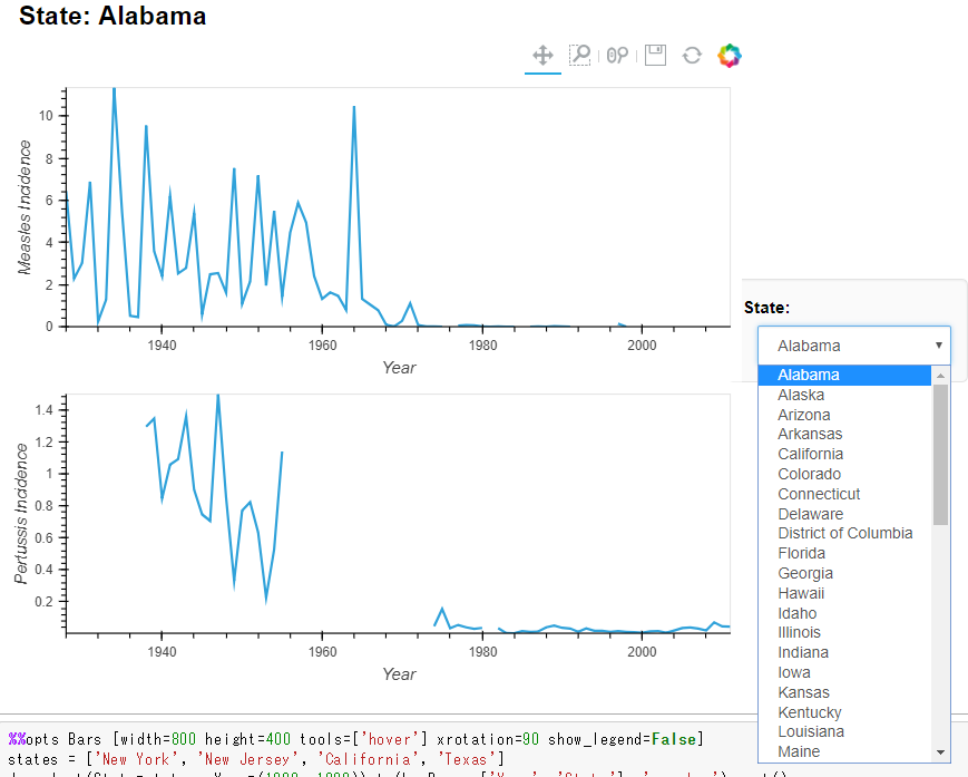
アメリカの州別の病気発生件数を可視化(百日咳と麻疹)


1
2
3
4
5
6
7
8
9
10
11
12
13
14
15
16
17
18
import numpy as np
import pandas as pd
import holoviews as hv
import codecs
hv.extension('bokeh', 'matplotlib')
import holoviews as hv
 
 
diseases = pd.read_csv('holoviews-master/examples/assets/diseases.csv.gz')
 
vdims = [('measles', 'Measles Incidence'), ('pertussis', 'Pertussis Incidence')]
ds = hv.Dataset(diseases, ["State","Year"], vdims)
 
ds = ds.aggregate(function=np.mean)
 
%opts Curve [width=600 height=250] {+framewise}
 
(ds.to(hv.Curve, 'Year', 'measles') + ds.to(hv.Curve, 'Year', 'pertussis')).cols(1)


Filed Under: Bokeh, HoloViews

BokehとHoloViewsを学ぶ

2018年5月10日 by 河副 太智 Leave a Comment

HoloViews.orgにて学んだ内容をまとめていきます。

HoloViewsとはオープンソースpythonライブラリーで
データ分析、ビジュアライゼーションを簡単に素早く行う事が可能

HoloViewsサンプル

HoloViews.orgに掲載されているサンプル
コードは驚くほどシンプルな構造

更にGalleryページにはBoken,Matplotlib,Plotlyを使用した
サンプルグラフがある

各グラフのコードのサンプルもHoloViews.orgにて紹介している


Holoviewのインストール

condaがお勧め

1
conda install -c ioam holoviews bokeh


上記で紹介したサンプルのグラフも含まれている

1
2
holoviews --install-examples
cd holoviews-examples


NY地下鉄の駅名情報を可視化

pandas,numpyを使用する
hv.extension(“bokeh”)でBokehのエクステンションをロードし
Bokehを使った可視化ができるようになる

他のプロットライブラリーも組み合わせ可能(matplotlib等)

1
2
3
4
import pandas as pd
import numpy as np
import holoviews as hv
hv.extension('bokeh')


次にニューヨークの地下鉄の駅名やその他情報を
含むデータセットを読み込む
csvファイルはこちら

1
2
station_info = pd.read_csv('/station_info.csv')
station_info.head()


可視化の為のオブジェクト

スキャッタープロット

hv.Scatterオブジェクトを使用して
駅の数と利用者数(百万単位)の2つをスキャッタープロット表示

1
2
scatter = hv.Scatter(station_info, 'services', 'ridership')
scatter


※画像のリンク先でグラフをドラッグで動かせる


csvのデータ(station_info)をhv.Scatterに渡し、scatterオブジェクトを作成
これ以外のエレメントはReference Galleryにて紹介

ヒストグラム

hv.Histogramオブジェクトを使用して地下鉄の駅開設日を
ヒストグラムにする

1
2
layout = hv.Histogram(np.histogram(station_info['opened'], bins=24), kdims=['opened'])
layout


+を使用して複数のグラフ表示

スキャッタープロットとヒストグラムなど複数のオブジェクトを
使用したグラフを横並びに表示する

1
2
layout = scatter + hv.Histogram(np.histogram(station_info['opened'], bins=24), kdims=['opened'])
layout


以下ここまでのコードまとめ

1
2
3
4
5
6
7
8
9
10
import pandas as pd
import numpy as np
import holoviews as hv
hv.extension('bokeh')
 
station_info = pd.read_csv('holoviews-master/examples/assets/station_info.csv')
scatter = hv.Scatter(station_info, 'services', 'ridership')
 
layout = scatter + hv.Histogram(np.histogram(station_info['opened'], bins=24), kdims=['opened'])
layout


神経スパイク列を可視化

脳のニューロン発火現象を記録したデータセットを用いて
発火時間(milliseconds)
神経細胞が発火する頻度をヘルツ(Hertz)
の2つのデータセットを可視化

csvファイル(spike_train.csv.gz)はこちら


pandasとholoviewsをインポートし、spike_trainにcsvを読み込ませる

1
2
3
import pandas as pd
import holoviews as hv
spike_train = pd.read_csv('/spike_train.csv.gz')

データフレームを表示

1
spike_train


hv.Curveでグラフ作成

可視化のオブジェクトにhv.Curveを使用
先ほど使用したhv.Scatter やhv.Histogramの仲間

hv.Curveの引数を左からcsv格納変数、インデックス名2つ、group=でグラフタイトル

1
curve = hv.Curve(spike_train, 'milliseconds', 'Hertz', group='Firing Rate')

bokehとmatplotlibをロード

1
2
hv.extension('bokeh', 'matplotlib')
curve

hv.Spikesでグラフ作成

1
2
spikes = hv.Spikes(spike_train.sample(300), kdims='milliseconds', vdims=[], group='Spike Train')
spikes

2つのグラフを並べる

1
curve + spikes


更にカスタマイズして見やすいグラフ作成
グラフ上にカーソルを合わせると各データをインタラクティブに表示

1
2
3
4
5
6
7
8
9
10
11
%%output size=150
 
%%opts Curve  [height=100 width=600 xaxis=None tools=['hover']]
 
%%opts Curve (color='red' line_width=1.5)
 
%%opts Spikes [height=100 width=600 yaxis=None] (color='grey' line_width=0.25)
 
curve  = hv.Curve( spike_train, 'milliseconds', 'Hertz')
spikes = hv.Spikes(spike_train, 'milliseconds', [])
(curve + spikes).cols(1)

%%output size=150で全体のサイズ
%%opts Curve でcurveグラフ個別の詳細設定

以下のグラフは画像ですのでインタラクティブ操作できません
実際に動かすにはこちらのグラフをご覧ください。

Filed Under: Bokeh, HoloViews, グラフ

Bokeh と Holoviewsで月食グラフをhtmlに変換

2018年5月7日 by 河副 太智 Leave a Comment

Bokeh と Holoviewsで月食グラフをhtmlに変換

1
2
3
4
5
6
7
8
9
10
11
12
13
14
15
16
17
18
19
20
21
22
23
24
25
import pandas as pd
import holoviews as hv
from bokeh.io import output_file, save, show
hv.extension('bokeh', 'matplotlib')
 
eclipses = pd.read_csv('../data/eclipses_21C.csv', parse_dates=['date'])
eclipses.head()
 
hv.Curve(eclipses)
 
curve= hv.Curve(eclipses)
renderer = hv.renderer('bokeh')
# rendererで保存
renderer.save(curve, 'graph')
# boken形式に変換
plot = renderer.get_plot(curve).state
 
# graph.htmlの名でhtmlファイルを出力
output_file('graph.html')
 
# プロット
show(plot)


Filed Under: Bokeh, グラフ, 作成実績

BokehとHoloviewsでグラフをhtmlにする

2018年4月23日 by 河副 太智 Leave a Comment

1
2
3
4
5
6
7
8
9
10
11
12
13
14
15
import holoviews as hv
curve = hv.Curve(range(10)) # Could be any HoloViews object
 
renderer = hv.renderer('bokeh')
 
# Using renderer save
renderer.save(curve, 'graph.html')
 
# Convert to bokeh figure then save using bokeh
plot = renderer.get_plot(curve).state
 
from bokeh.io import output_file, save, show
 
output_file("graph.html")
show(plot)


Filed Under: Bokeh, グラフ

周期表をbokehでhtml出力

2018年4月18日 by 河副 太智 Leave a Comment

1
2
3
4
5
6
7
8
9
10
11
12
13
14
15
16
17
18
19
20
21
22
23
24
25
26
27
28
29
30
31
32
33
34
35
36
37
38
39
40
41
42
43
44
45
46
47
48
49
50
51
52
53
54
55
56
57
58
59
60
61
62
63
64
65
66
67
68
69
70
71
72
73
74
75
from bokeh.io import output_file, show
from bokeh.models import ColumnDataSource, HoverTool
from bokeh.plotting import figure
from bokeh.sampledata.periodic_table import elements
from bokeh.transform import dodge, factor_cmap
 
output_file("period.html")
 
periods = ["I", "II", "III", "IV", "V", "VI", "VII"]
groups = [str(x) for x in range(1, 19)]
 
df = elements.copy()
df["atomic mass"] = df["atomic mass"].astype(str)
df["group"] = df["group"].astype(str)
df["period"] = [periods[x-1] for x in df.period]
df = df[df.group != "-"]
df = df[df.symbol != "Lr"]
df = df[df.symbol != "Lu"]
 
cmap = {
    "alkali metal"         : "#a6cee3",
    "alkaline earth metal" : "#1f78b4",
    "metal"                : "#d93b43",
    "halogen"              : "#999d9a",
    "metalloid"            : "#e08d49",
    "noble gas"            : "#eaeaea",
    "nonmetal"             : "#f1d4Af",
    "transition metal"     : "#599d7A",
}
 
source = ColumnDataSource(df)
 
p = figure(title="Periodic Table (omitting LA and AC Series)", plot_width=1000, plot_height=450,
           tools="", toolbar_location=None,
           x_range=groups, y_range=list(reversed(periods)))
 
p.rect("group", "period", 0.95, 0.95, source=source, fill_alpha=0.6, legend="metal",
       color=factor_cmap('metal', palette=list(cmap.values()), factors=list(cmap.keys())))
 
text_props = {"source": source, "text_align": "left", "text_baseline": "middle"}
 
x = dodge("group", -0.4, range=p.x_range)
 
r = p.text(x=x, y="period", text="symbol", **text_props)
r.glyph.text_font_style="bold"
 
r = p.text(x=x, y=dodge("period", 0.3, range=p.y_range), text="atomic number", **text_props)
r.glyph.text_font_size="8pt"
 
r = p.text(x=x, y=dodge("period", -0.35, range=p.y_range), text="name", **text_props)
r.glyph.text_font_size="5pt"
 
r = p.text(x=x, y=dodge("period", -0.2, range=p.y_range), text="atomic mass", **text_props)
r.glyph.text_font_size="5pt"
 
p.text(x=["3", "3"], y=["VI", "VII"], text=["LA", "AC"], text_align="center", text_baseline="middle")
 
p.add_tools(HoverTool(tooltips = [
    ("Name", "@name"),
    ("Atomic number", "@{atomic number}"),
    ("Atomic mass", "@{atomic mass}"),
    ("Type", "@metal"),
    ("CPK color", "$color[hex, swatch]:CPK"),
    ("Electronic configuration", "@{electronic configuration}"),
]))
 
p.outline_line_color = None
p.grid.grid_line_color = None
p.axis.axis_line_color = None
p.axis.major_tick_line_color = None
p.axis.major_label_standoff = 0
p.legend.orientation = "horizontal"
p.legend.location ="top_center"
 
show(p)


Filed Under: Bokeh, グラフ Tagged With: Bokeh

  • « Go to Previous Page
  • Page 1
  • Page 2

Primary Sidebar

カテゴリー

  • AWS
  • Bootstrap
  • Dash
  • Django
  • flask
  • GIT(sourcetree)
  • Plotly/Dash
  • VPS
  • その他tool
  • ブログ
  • プログラミング
    • Bokeh
    • css
    • HoloViews
    • Jupyter
    • Numpy
    • Pandas
    • PosgreSQL
    • Python 基本
    • python3
      • webアプリ
    • python3解説
    • scikit-learn
    • scipy
    • vps
    • Wordpress
    • グラフ
    • コマンド
    • スクレイピング
    • チートシート
    • データクレンジング
    • ブロックチェーン
    • 作成実績
    • 時系列分析
    • 機械学習
      • 分析手法
      • 教師有り
    • 異常値検知
    • 自然言語処理
  • 一太郎
  • 数学
    • sympy
      • 対数関数(log)
      • 累乗根(n乗根)
    • 暗号学

Copyright © 2025 · Genesis Sample on Genesis Framework · WordPress · Log in