Jupyterの同じ階層にcsvをアップする
|
1 |
sales_sparkring = pd.read_csv('monthly-australian-wine-sales-th-sparkling.csv') |
Jupyterの同じ階層にcsvをアップする
|
1 |
sales_sparkring = pd.read_csv('monthly-australian-wine-sales-th-sparkling.csv') |
|
1 2 3 4 5 6 7 8 9 10 11 12 13 14 15 16 17 18 19 20 21 22 23 24 25 26 27 28 29 30 31 32 33 34 35 36 37 38 39 40 41 42 43 44 45 46 47 48 49 50 51 52 53 54 55 56 57 58 59 60 61 62 63 64 65 66 67 68 69 70 71 72 73 74 |
print(__doc__) import itertools import numpy as np import matplotlib.pyplot as plt from sklearn import svm, datasets from sklearn.model_selection import train_test_split from sklearn.metrics import confusion_matrix # import some data to play with iris = datasets.load_iris() X = iris.data y = iris.target class_names = iris.target_names # Split the data into a training set and a test set X_train, X_test, y_train, y_test = train_test_split(X, y, random_state=0) # Run classifier, using a model that is too regularized (C too low) to see # the impact on the results classifier = svm.SVC(kernel='linear', C=0.01) y_pred = classifier.fit(X_train, y_train).predict(X_test) def plot_confusion_matrix(cm, classes, normalize=False, title='Confusion matrix', cmap=plt.cm.Blues): """ This function prints and plots the confusion matrix. Normalization can be applied by setting `normalize=True`. """ if normalize: cm = cm.astype('float') / cm.sum(axis=1)[:, np.newaxis] print("Normalized confusion matrix") else: print('Confusion matrix, without normalization') print(cm) plt.imshow(cm, interpolation='nearest', cmap=cmap) plt.title(title) plt.colorbar() tick_marks = np.arange(len(classes)) plt.xticks(tick_marks, classes, rotation=45) plt.yticks(tick_marks, classes) fmt = '.2f' if normalize else 'd' thresh = cm.max() / 2. for i, j in itertools.product(range(cm.shape[0]), range(cm.shape[1])): plt.text(j, i, format(cm[i, j], fmt), horizontalalignment="center", color="white" if cm[i, j] > thresh else "black") plt.tight_layout() plt.ylabel('True label') plt.xlabel('Predicted label') # Compute confusion matrix cnf_matrix = confusion_matrix(y_test, y_pred) np.set_printoptions(precision=2) # Plot non-normalized confusion matrix plt.figure() plot_confusion_matrix(cnf_matrix, classes=class_names, title='Confusion matrix, without normalization') # Plot normalized confusion matrix plt.figure() plot_confusion_matrix(cnf_matrix, classes=class_names, normalize=True, title='Normalized confusion matrix') plt.show() |

#欠損値処理 (欠損値の指定defaultは’NaN’,mean, median, mode のどれか,行か列かの指定
med_imp = Imputer(missing_values=0, strategy=’median’, axis=0)
med_imp.fit(X.iloc[:, 1:6])
X.iloc[:, 1:6] = med_imp.transform(X.iloc[:, 1:6])
missing_values
これで欠損値であるものを指定。 defaultは’NaN’
strategy
ここで、mean, median, mode のどれかを指定します。
axis
行か列かの指定
verbose
理論値
copy
コピーするか、元のデータ自体に変更を加えるかの指定
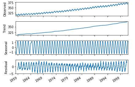
季節調整済とは原系列をトレンド、季節変動、残差分類する事
(原系列 = トレンド + 季節変動 +残差)
原系列 – トレンド – 季節変動 = 残差
例えば気温の観測においては
夏と冬では気温差が激しいのでそこは考慮せず、
年単位で計測する地球温暖化による気温の変化を計測する場合に使用する
|
1 2 3 4 5 6 7 8 9 10 11 12 13 14 15 16 17 |
import pandas as pd import matplotlib.pyplot as plt import statsmodels.api as sm from pandas import datetime import statsmodels.api as sm %matplotlib inline import numpy as np # データの読み込み co2_tsdata = sm.datasets.co2.load_pandas().data # 欠損値の処理 co2_tsdata2 = co2_tsdata.dropna() # 季節調整とグラフのプロット res = sm.tsa.seasonal_decompose(co2_tsdata2,freq=51) fig = res.plot() plt.show() # 何も書き込まず実行してください |
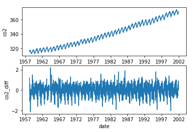
階差系列グラフは定常性を持たせるためのもの。
階差系列とは時系列データの隣りのデータで処理する事。
[1,5,3,5,3,2,2,9]の時系列データを階差系列にすると
[4,-2,2,-2,-1,0,7]となる
コードはaaa.diff()
(aaaはデータが入った変数)
そこからさらに階差数列をとると2次の階差数列となる。
|
1 2 3 4 5 6 7 8 9 10 11 12 13 14 15 16 17 18 19 20 21 22 23 24 |
import pandas as pd import matplotlib.pyplot as plt import statsmodels.api as sm from pandas import datetime %matplotlib inline import numpy as np co2_tsdata = sm.datasets.co2.load_pandas().data # 欠損値 co2_tsdata2 = co2_tsdata.fillna(method="ffill") # 原系グラフ plt.subplot(2,1,1) plt.xlabel("date") plt.ylabel("co2") plt.plot(co2_tsdata2) # 階差グラフ plt.subplot(2,1,2) plt.xlabel("date") plt.ylabel("co2_diff") co2_data_diff = co2_tsdata2.diff() # プロット plt.plot(co2_data_diff) plt.show() |
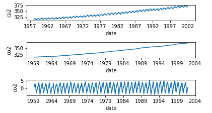
移動平均とは、k個の連続する値の平均値を取得
時系列データの特定区間で移動させながら取得を繰り返すこと
元のデータの特徴を維持し、データを滑らかにする
月ごとのデータに季節変動があれば、
12個の連続する値の移動平均で、季節変動を除去でき、
トレンドを抽出。
それから移動平均を元の系列から引き、
系列のトレンド成分を除去する
|
1 2 3 4 5 6 7 8 9 10 11 12 13 14 15 16 17 18 19 20 21 22 23 24 25 26 27 28 29 30 31 |
import pandas as pd import matplotlib.pyplot as plt import statsmodels.api as sm from pandas import datetime %matplotlib inline import numpy as np co2_tsdata = sm.datasets.co2.load_pandas().data # 欠損値の処理 co2_tsdata2 = co2_tsdata.fillna(method="ffill") # 原系列のグラフ plt.subplot(6,1,1) plt.xlabel("date") plt.ylabel("co2") plt.plot(co2_tsdata2) # 移動平均を求める co2_moving_avg = co2_tsdata2.rolling(window=51).mean() # 移動平均のグラフ plt.subplot(6,1,3) plt.xlabel("date") plt.ylabel("co2") plt.plot(co2_moving_avg) # 原系列-移動平均グラフ plt.subplot(6,1,5) plt.xlabel("date") plt.ylabel("co2") mov_diff_co2_tsdata = co2_tsdata2-co2_moving_avg plt.plot(mov_diff_co2_tsdata) plt.show() # 何も書き込まず実行してください |